

Kelly Fiorini
Kelly Fiorini is a freelance writer for G2. After ten years as a teacher, Kelly now creates content for mostly B2B SaaS clients. In her free time, she’s usually reading, spilling coffee, walking her dogs, and trying to keep her plants alive. Kelly received her Bachelor of Arts in English from the University of Notre Dame and her Master of Arts in Teaching from the University of Louisville.
What is a PERT chart?
A PERT chart is a project management tool for mapping out tasks and timelines related to a specific project. PERT stands for program evaluation and review technique.
A PERT chart is a visual representation of the project’s flow. Developed by the U.S. Navy in the 1950s for a submarine missile program, these charts have helped project managers monitor progress, identify bottlenecks, and complete projects on time for over 70 years.
Today, teams use project management software to design and build PERT charts. It lets users start from templates to create project plans based on the scope, and it supports multiple methodologies from waterfall to agile.


Basic elements of a PERT chart
PERT charts work by helping teams visualize any tasks and their dependencies. The chart’s design has three major features:
- Nodes. On a PERT chart, nodes represent tasks or milestones the team needs to hit to keep the project moving. These nodes appear in boxes or circles, depending on the software used and the team’s preferences.
- Directional arrows. These arrows connect nodes on the diagram in a specific sequence. One event must happen before the team proceeds to the next one.
- Divergent arrows. At some points on the chart, team members may work on tasks concurrently or in their preferred order. To note this, the chart uses divergent arrows, which stem from a single node in different directions.
Once the team connects nodes with arrows, they can see the flow of what must happen and in what order. This helps team members recognize the logical path to completion.
Time estimation with a PERT chart
One of the benefits of a PERT chart is that it factors in potential uncertainties and delays that might affect the project timeline. PERT uses a three-prong estimation technique to help teams complete a project on time or ahead of schedule:
- Optimistic estimate. The shortest time a project could take, with all favorable situations occurring and no risks or threats.
- Pessimistic estimate. The longest time a project could take, with all detrimental conditions and no mitigation of those issues.
- Most likely estimate. The typical amount of time a project should take, with both favorable and detrimental conditions occurring.
Time estimates use probability theory and statistical analysis. Project management software automatically calculates these complex computations.
Benefits of a PERT chart
PERT charts have stayed in favor for decades for their ability to plan and organize complex programs. Some reasons a team might choose to use a PERT chart include:
- Identifying the critical path. A PERT chart lets teams see the sequence of tasks that must happen on schedule to deliver the project on time. This helps project management teams prioritize tasks and determine how to allocate resources.
- Encouraging communication. With a big-picture project overview, managers keep all team members on the same page. Plus, they can communicate the timeline more easily to clients.
- Monitoring progress. With software, teams can update the PERT chart to reflect current progress in real time. This helps project managers identify issues and mitigate risks to keep the project on schedule.
Steps to create a PERT chart
No matter what kind of program or project a team leads, the process of creating a PERT chart remains the same. Teams typically follow these four steps for building a PERT chart to organize complex projects:
- Clarify project scope. The team collects all the necessary information from stakeholders and meets to discuss the project’s scope and goals. This crucial step ensures everyone understands outcomes and objectives.
- Break the project into its components. Teams then identify necessary tasks and their dependencies. This breaks the work into smaller pieces, making the project feel more manageable and allowing the team to monitor work completion.
- Create a sequence. Once a team knows the essential milestones in a project, it’s time to string them together in a logical sequence. The team connects nodes with directional or divergent arrows to create a diagram.
- Build time estimates. With the help of software, the team estimates how long each task will take with, most likely, optimistic and pessimistic situations. Then the team builds a timeline for the project as a whole.
Once they complete the PERT chart, all team members refer to it frequently to identify the next steps. They also update the chart regularly to show project progress and changes.
PERT chart vs. Gantt chart
PERT charts and Gantt charts are both project management tools that help companies visualize and plan projects. These charts have some key differences.
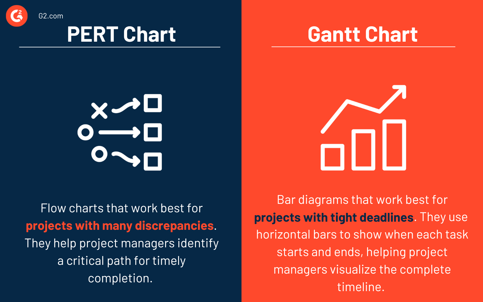
PERT charts are flow charts that work best for projects with many dependencies. They help project managers identify a critical path for timely completion.
Gantt charts are bar diagrams that work best for projects with tight deadlines. These charts use horizontal bars to show when each task starts and ends, helping project managers visualize the complete timeline.
PERT charts are most useful for time estimation and planning before a project starts, while Gantt charts are most helpful once a project is in motion. Depending on their needs, some teams use both project management tools.
Build a stronger project management foundation and start your journey to a successful project.
