

Ninisha Pradhan
Ninisha is a former Content Marketing Specialist at G2. She graduated from R.V College of Engineering, Bangalore, and holds a Bachelor's degree in Engineering. Before G2, Ninisha worked at a FinTech company as an Associate Marketing Manager, where she led Content and Social Media Marketing, and Analyst Relations. When she's not reading up on Marketing, she's busy creating music, videos, and a bunch of sweet treats.
Landing pages – one small step for a customer, one giant leap for a business.
When the moon landing occurred in 1969, people questioned why going to the moon was even necessary. It’s quite simple: landing on the moon was a sign of technological strength. People were convinced of the power that the moon held so much that scientists across the world raced to get there first.
In a sense, you could say that the moon was the very first landing page.
Today’s landing pages aren’t as mighty as a floating rock in space, but to businesses, they come pretty close.
By now, you might’ve landed on your fair share of landing pages and probably even built some. As advertising continues to evolve, and the number of landing page builders continues to dominate the market, that becomes true of many internet users. Despite their growing prevalence, there’s still a disconnect among digital marketers regarding what a landing page is.
The ones you’ve landed on may have been different kinds of pages, and the ones you’ve built may not have even been a landing page. And that, for both the user and the creator, opens a whole can of worms.
What is a landing page?
A landing page is a standalone web page, independent from a website’s navigation, built for the singular purpose of compelling visitors to take an action. This action could be a sign-up, a download, or a purchase. It features persuasive elements, like benefit-oriented copy and social proof, to accomplish this goal.
This definition is contrary to the common, loose definition of a landing page, which is simply a page you “land on”. This has many believing that a landing page can be your pricing page, a page that talks about your company, or even your homepage. But that’s a damaging description.
A landing page is designed to convert, while most other pages aren’t. The majority are built to inform. A pricing page lays out pricing. An “about us” page might describe your business' philosophy or history. A product page highlights the features of your modules, and a homepage should be the launchpad to those other pages.
This is why it’s important for digital marketing teams to set predefined goals for a landing page and its ultimate purpose.
Questions to ask before creating a landing page
Before creating your landing page, first ask yourself the following questions.
1. What are our conversion goals? We know that landing pages are intended to convert visitors. But what kind of conversion are we talking about? Does your business have micro-conversion goals (subscribe to an email newsletter, download gated content, etc.) or macro-conversion goals (fill out a form or purchase something)?
You have to define conversions before tracking them. Understanding your conversion goals help optimize your conversion rates and determine what kind of landing page is required.
2. What kind of metrics are we looking for? After settling the conversion goals for your landing page, the next thing to look at is targets. This is all about numbers. What kind of results are you expecting from a landing page?
This ties in with how you expect your ad campaign to perform – if you have a landing page for a digital ad, that is. Research what kind of figures other brands in the same space usually see, and visualize how these numbers can be optimized. Set the right metrics to track as well as the tools you need to monitor this movement.
3. Who is the target audience? Whether you’re selling to Baby Boomers in the financial space or Gen Z TikTok users, you need to know who your audience is – and more importantly – what their voice is. How you present your landing page copy can change drastically depending on your industry and the audience you cater to. Your content needs to clearly communicate what your offering is and be appealing enough to your target market for any chance of persuading them.
4. How did the visitors land on our page? Landing pages are usually the final destination for visitors. The journey to this destination, however, can vary from person to person. Some users may have clicked on a link in an email campaign, while others may have arrived at a landing page from an ad campaign.
Observing which channel or source drives the most clicks is a good way to assess how the landing page needs to read and what kind of campaigns need to be focused on. Tailoring different landing pages for each campaign is a time-consuming process, so it makes sense to filter out the popular ones and customize pages accordingly.
5. What are my competitors doing? “Take a look at my homework but don’t make it look like you copied everything.” This probably applies to school, but it's kind of a grey area when it comes to business. The best landing page templates are the ones that your competitors have published. Not only are they speaking the same language as you, but they might have even implemented a few elements you wouldn’t have considered earlier. The best kind of research is the one that’s been done for you by your competitors.
Tip: Be a step ahead of the competition with market intelligence and make strategic moves.
Want to learn more about Landing Page Builders? Explore Landing Page Builders products.
Elements of a landing page
There are several key elements that comprise a landing page. It isn’t necessary to have every one of these elements but there are a few that make or break the landing page experience for a visitor.
Let’s take a look at some of the standard elements in a landing page.
Above-the-fold content
Basketball fans around the world know that courtside seats are the best in the house. It’s where spectators get access to all the action up close.
Above-the-fold content is the equivalent of courtside seats on a landing page.
It’s the first thing visitors see when they click on a landing page and counts for the very first impression made on a user, making it prime real estate. Originally a term used by magazines and newspapers, above-the-fold content acts as the front page.
Not to be confused with the actual headline (which we’ll get into later), above-the-fold content comprises all the elements that fit in the first screen that someone views without scrolling down. “Fold” here refers to the bottom half of the screen that needs to be scrolled down on for someone to see it.
This is why there’s pressure to keep the first half of the front page very interesting. If all the juicy info is on the bottom half of a newspaper, no one would see it or feel compelled to buy it fresh off the racks.
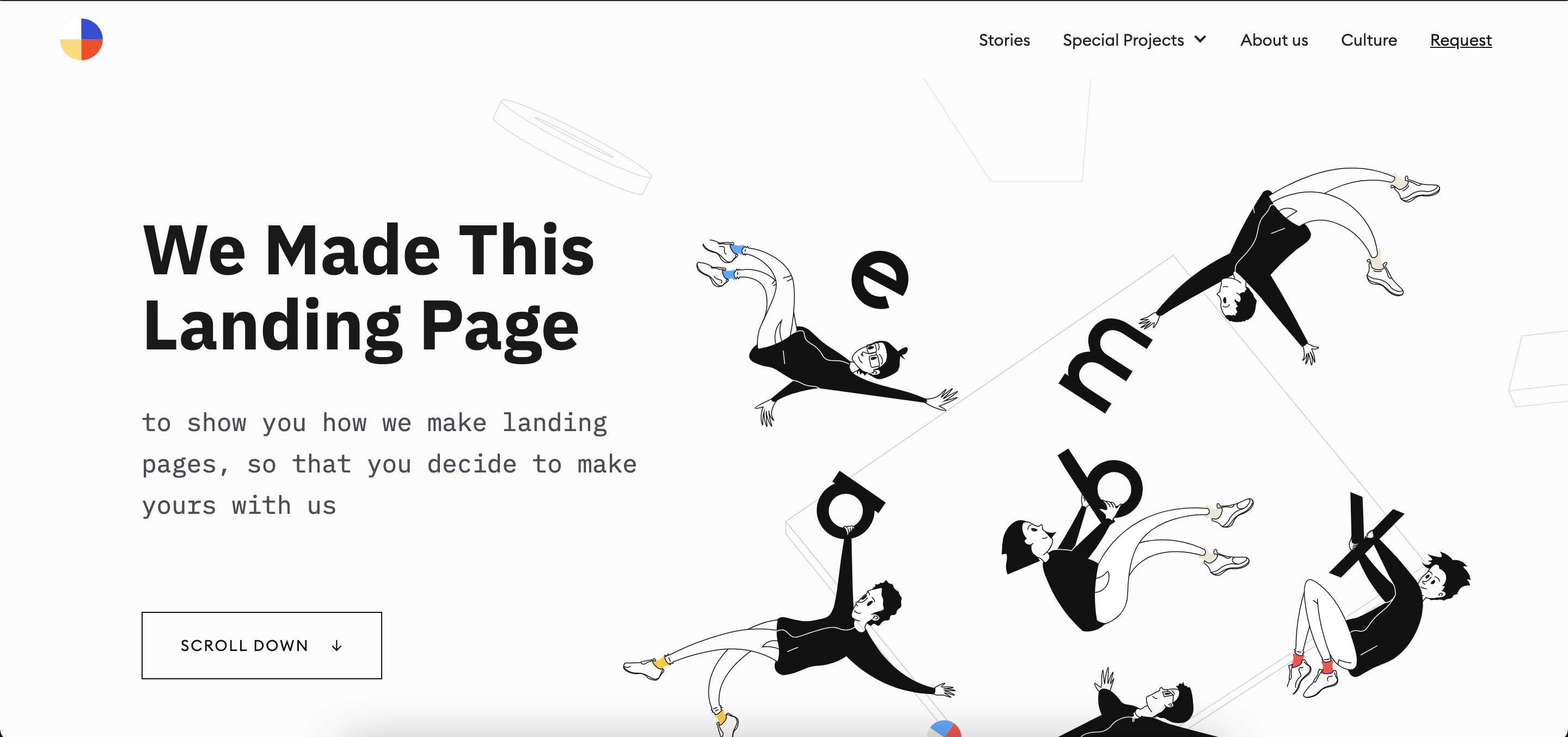 Source: Embacy
This landing page by Embacy has some interesting, cheeky above-the-fold content. They put their money where their mouth is by immediately getting their value proposition across. Since there’s only so much space that’s visible, above-the-fold content needs to be as compelling as possible if you want any chance of drawing people in. Not only does this landing page achieve that, it makes use of their 500-pixel space with relevant content.
Main headline
“Extra! Extra! Read all about it!”
We’ve already established that the above-the-fold content should be enticing enough for visitors to scroll through the landing page. The main headline is a crucial part of what constitutes above-the-fold content. The juicier the headline, the harder it is to ignore.
But headlines are more than just clickbait. They indicate what a visitor should come to expect from a landing page. Visitors click on a landing page because they’re looking for something specific.
Headlines inform people what they should expect from a particular landing page and how their brand can offer a solution. A landing page that’s designed to generate sign-ups for a webinar should have a headline that clearly indicates what the event is about. Similarly, landing pages that offer gated content should have headlines that explain the topic of the asset and what kind of content it covers.
Ultimately, how you choose your headlines should be guided by these three factors:
- Who your audience is
- The action you want your audience to take
- What you’re offering through this landing page
If your headline doesn’t meet all three of these criteria, you’re offering a bad user experience to your visitors.
Supporting headline
There’s only so much information you can pack in the main headline, which is why every landing page needs a supporting headline right below it.
A supporting headline expands on the main headline by offering a bit more description about what the page entails, highlighting any information that couldn’t fit into the main headline. This is what makes your headline pack some punch and make it all the more alluring to readers. It’s not a compulsory element to include, but it definitely creates an impact on any landing page when used correctly.
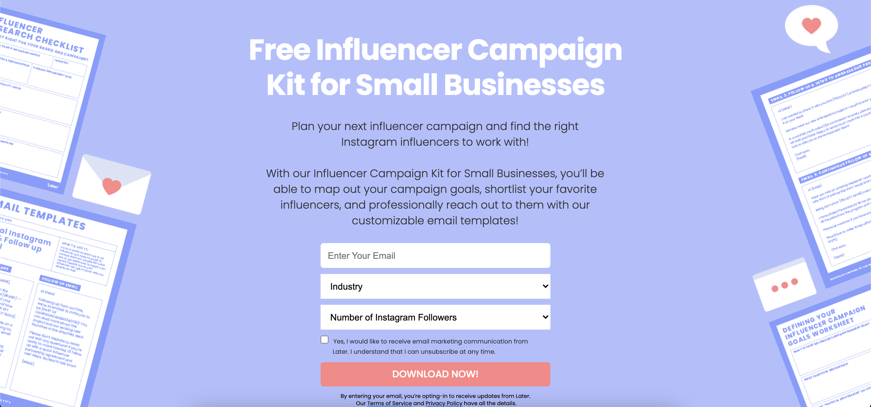 Source: Later
Later’s main and supporting headlines contain ample information and give a quick, detailed overview of what visitors should expect from their landing page. Not only do they indicate what their offering is (a free kit), they also do a good job of explaining how this downloadable asset is a great value add for their intended audience (small businesses). It’s concise, clear, and informative.
Featured image/hero shot
The featured image is more than just eye candy for a landing page; it can pass along information in a way that words cannot.
Yes, a featured image is a great aesthetic element. There are plenty of landing page examples that showcase some really interesting and unique hero shots. But featured images can be functional as well as decorative.
Here are a few ways a featured image can be used on a landing page:
- Display company brand elements: You spend considerable time deliberating what your company’s colors and branding should look like. Incorporating these elements within your featured image ties the landing page together with the overall look and feel of the company’s website. Beyond logos and colors, try adding design assets that are visible on your main site to create a brand recall.
-
Feature your product: While videos and images that showcase an organization’s product are regularly seen on websites, featured images can display prominent features of a product or service offering.
Imagine your business sells low-code platforms. If your landing page is designed to get people to download an eBook or a few case studies, adding a snapshot of your product that highlights a particular use case can find its place on the featured image. Not only does it serve a design purpose, but your visitors get to see your product at the very first click.
- Explain your headline: Hero shots act as visual aids to words. If your headline is somewhat unique and not extremely direct, a featured image serves the role of a description and gives viewers a better idea of what your page is trying to convey. This can be observed in the example below:
 Source: Awwwards
Summary of the features/benefits
Until now, we’ve been covering elements that feature as a part of above-the-fold content. We’re almost getting to the middle of the landing page (or the meatier section). Once a visitor is intrigued by the headline, the next step for them is to understand what exactly your page is claiming to offer. This is where a features section or a benefits section plays a huge role.
There’s no rule about where this section can be placed; there are landing pages that feature a few benefits at the top or just below the main headline. Irrespective of where the features or benefits section is placed, it needs to drive people from the top to the bottom of the landing page. Essentially, it acts like a hook that reels people further down.
Since this is supposed to be a summary of the points you want to highlight, you don’t want to scare your viewers off with too much content. There’s a whole section for more descriptive content below-the-fold. Keep it crisp with a few bullet points and short lines.
Main body/content
If your visitors have gotten this far on the landing page, congratulations – you have a potential conversion on your hands.
The main body explains a little more in detail what the headings, the image, and the features summary section have given an overview of. This is where someone takes the time to read through and evaluate action that needs to be taken on your page. This is why the content here matters a lot. This is also a section most businesses get wrong.
It’s tempting to throw out your sales deck content here and make the landing page a faux sales pitch. But if someone wanted to hear a sales pitch, they’d request a demo, not scroll through a landing page.
The body needs to be equal parts informative and appealing to a visitor. When constructing your landing page, put yourself in the customer’s shoes and ask yourself the following questions:
- What are we expecting visitors to do?
- Why should they check out your product?
- What are they going to get in return?
- Is it an equal tradeoff? What else could a visitor be looking for?
- Does this solve any immediate problem your audience may have?
If there’s one sentiment that you want your visitors to take away from your landing page, it’s this: “This product/deal will solve my problem, make my life easier, and is worth exploring.”
Social proof
Guess what? No matter how hard you try, marketing will always sound like marketing. That doesn’t mean it’s not effective; it just means people need a little bit more of a push to take action and trust a business.
That’s where social proof comes into the picture.
Social proof offers authenticity, credibility, and ample information about your product to the buyers. What others say about a product matters to potential customers. If customers leave glowing reviews about software, you’d feel more confident about pitching it to your management.
Social proof comes in many forms:
- Testimonials from credible sources
- Awards and accolades from a celebrated community
- Glowing reviews from real customers
- A note from brand advocates (especially revered leaders within the industry)
Adding social proofs immediately elevates your brand to a visitor. The only catch with social proofs is that they need to be verified. Anyone can claim that their product is the best. Hearing it from someone that’s real and unbiased is what makes the “proof” in social proof.
Did you know?: Customers' reviews on G2 are verified and vetted before they’re published.
Call-to-action (CTA)
Calls-to-action (CTAs) are the vehicle that drives action. This little element forms the crux of your landing page. While CTAs aren’t as complex as other sections that require text or images, their placement matters a lot.
The rules that surround a CTA differ. Many say that a CTA button shouldn’t be too long, contain a word or two like “Subscribe Now” or “Download”. Others say that adding an incentive within a CTA can drive more clicks. Some examples of this are deals and discounts like “Sign up today and get a free template!”
People also disagree about the placement of a CTA button. Some say keeping a CTA button right at the top of the page is a surefire way of getting seen and clicked on, whereas some strongly feel that keeping a CTA button at the top could be construed as promotional and pushy.
There’s no hard and fast rule when it comes to designing and placing a CTA button. What should be a rule of thumb is conducting A/B tests and multivariate testing.
A/B testing evaluates your original page (or the “A” page) against the page with variations (the “B” page). In such a test, a sample group of visitors is randomly assigned to one webpage version to ensure there’s no bias based on any differentiating factors. The results of this test should indicate which page performs better for a particular goal.
Multivariate testing focuses on very specific elements and features within a single page, as opposed to A/B testing, which compares results across different pages.
Testing out different iterations of your CTA and its placement on a page can give you a clear indication as to what works and what needs to go.
What are the major design features of a landing page?
While a landing page has several different elements associated with it, there are a few design features that must remain consistent across each element. They may not be considered in the typical sense of “design”. Generally, the term “design” refers to aesthetic elements. These design features are factors that should be kept in mind while designing the entire landing page.
Broadly speaking, there are two major design features that can be seen in well-thought-out landing pages: message match and 1:1 conversion ratio.
Let’s look at each feature separately.
Message match
On a landing page, a message match has two distinct purposes:
First, a message match instills trust in visitors. When they see the same images, colors, and words, they know immediately that they’re in the right place. They haven’t been redirected somewhere else. The page they’re on is connected with the advertisement they clicked.
Second, a message match reinforces personalization in the post-click stage. In the pre-click stage, before the visitor clicks an ad, personalization is accomplished with targeting tools.
If you’re a social media monitoring software, you might target social media managers in one ad. In a second ad, you may try a different approach for small business owners. In a third, you might target marketing agencies. Try a few different variants via A/B tests.
If you send all these audiences to the same landing page, you’re making all the segmentation you’ve done in the pre-click stage redundant. This is why every promotion needs its own landing page. The post-click stage is where personalization is completed with a message match to finish the conversation started by the ad.
1:1 conversion ratio
The second major design element is a 1:1 conversion ratio. The term “conversion ratio” refers to the number of links on a landing page to the number of conversion goals. Ideally, this should be 1:1. There should be only one link that drives visitors off the page, and that should be the CTA button.
When faced with the decision to convert or not, your visitors should have two options: Click the CTA button or click the back button. A landing page should have no links in the footer, none in the navigation, none hyperlinked in text or social icons, or anywhere else. This keeps your visitors focused on conversion.
If you’re asking, what if visitors need to see the pricing page in order to decide whether or not to convert? Then your pricing information should be on the landing page. Your landing page should contain all the information that your prospects need to make a decision about your offer.
Difference between a landing page and a website
Driving traffic to your homepage is a big objective businesses aim to achieve. Naturally, some people may begin to wonder why there’s even a need for a landing page in the first place when you have a stellar website.
The reason why landing pages are required boils down to the difference between homepages and landing pages.
Homepages are all-encompassing; they are a single destination that leads to several different points across a company’s website.
The goals of a homepage are numerous. Here are a few objectives of a homepage:
- Educate visitors about a company and its product
- Showcase all the product offerings spread across different pages or sections
- Advertise upcoming events or product updates
- Establish company branding
- Link to relevant pages like Careers, Newsroom, Resources
- Build awareness
The primary objective of a homepage is to build awareness. It’s a top-of-the-funnel channel that is used to greet and inform new traffic.
Landing pages have a completely different primary objective. The goal with a landing page is to convert visitors. It’s a middle- or bottom-of-the-funnel instrument used to drive conversions or complete a micro- or macro-conversion goal. By this stage, visitors are already aware of what your business does and offers. A landing page encourages users to complete an action and push them further along the funnel.
Homepages aren’t intended to convert users. That doesn’t mean you can’t see any conversions. It’s a little harder to get a conversion on a homepage because buyer intent hasn’t been established yet. Usually visitors are in the discovery phase when they land on a homepage.
Homepages aren’t as focused as landing pages since they have many links that divert a user’s attention. On the other hand, landing pages minimize the number of links that could redirect a visitor away from the page and distract them from achieving a business’ conversion goals.
Difference between landing pages and splash pages
Splash pages or splash screens are an introduction to your site and its contents. A splash page aims to inform users, often driving them to a specific call to action. While this sounds similar to what a landing page does, there’s a stark difference between the two.
Splash pages should not generate leads. Typically these include a short introductory statement, advertise a product or an event, provide unique offers, or even notify visitors about an update. It mainly comprises a couple of lines, graphics, and one exit link. Splash pages are visually intensive. That's why graphics and design play greater importance here.
A landing page is a standalone page on your site. There’s more copy involved in a landing page than on a splash page and for good reason: Landing pages aim at converting a user through downloads, subscriptions, or even purchases, and are most notably used for high-intent actions. Calls-to-action on a landing page usually culminate with a visitor converting into a customer.
.png)
In short, landing pages and splash pages can both feature similar content and structure but have entirely different conversion goals.
Types of landing pages
There’s no one-size-fits-all landing page for your visitors or the situations they’re in. The page you use depends on the goal of your campaign. You can enhance and strengthen user engagement through landing pages. Not only does this optimize conversions, but it also makes sure businesses see bigger returns on their pay-per-click (PPC) spending. Boosting conversions can be far more achievable by making sure you're using the appropriate type of landing page.
Here are seven types of landing pages you should know about.
1. Squeeze page
In the early stages of the buyer’s journey, your prospect doesn’t know you. Ultimately, their goal is to find out if you’re the solution they’re looking for. At this stage, the email address is your most valuable piece of information.
Squeeze pages are designed to capture email addresses by offering something in return. These pages are so effective for getting emails since they offer a lot for very little. Whether it’s an eBook, an audit, a report, or a blueprint, these landing pages offer it in exchange for just an email address.
Squeeze pages are designed to be easy to consume. They’re the most basic form of landing pages with minimal copy and a basic image. They aren’t visually heavy, nor do they use up a lot of space for other elements like social proof, long forms, or elaborate headlines.
2. Lead generation landing page
An email address is great for capturing and nurturing a lead, but what’s even better is getting qualified leads.
Marketers are tasked with getting marketing qualified leads (MQLs). This ensures that the contact received from any campaign is on the same page as the business and is actively looking out for a solution to purchase. A great way to screen visitors is through a lead capture form.
A lead generation or lead capture page utilizes these lead capture forms to collect MQLs. These pages work especially well for prospects somewhere in the middle of the funnel or their evaluation stage.
The lead capture form solicits personal information in exchange for a lead magnet, the way a squeeze page does but unlike a squeeze page, lead capture landing pages to use longer forms. A squeeze page asks for an email address, while a lead capture landing page raises the ante. These forms are longer and request information like company size, phone number, budget, and location.
While the number of form fields can differ from organization to organization, a good rule of thumb is to keep forms short and free of any unnecessary fields. This will help increase conversions as visitors won’t feel overwhelmed filling out forms and giving too many details.
3. Click-through landing page
Sometimes, big forms can scare prospects – especially if those forms request sensitive information, like a credit card number. For businesses trying to get high-value conversions, a click-through page is sometimes necessary.
Click-through landing pages, unlike lead generation landing pages, don’t utilize a form. They’re used in ad campaigns by linking a particular ad to the checkout stage. It’s simple, quick, and gets visitors converted into paying customers within a few clicks. These kinds of landing pages are commonly seen on e-commerce sites.
Click-through pages do a great job of relieving friction, i.e. the elements of a landing page that make prospects uncomfortable with conversion. These pages often feature elements that instill trust in visitors, like security badges, money-back guarantees, testimonials, and comprehensive copy.
4. Sales page
Sales pages are arguably the toughest landing page to create simply because a sale is one of the hardest conversions to elicit. The stakes are much higher for a sales page because unlike other landing pages that we’ve seen so far, the end goal isn’t obtaining a lead here – it’s obtaining a customer. These are high-converting landing pages.
This is why sales pages often necessitate a comprehensive landing page. The type of content depends highly on the value of the sale. If a product is high-commitment – say an expensive or a recurring subscription, for example – the page has to be longer because it’ll require more persuasive elements to get visitors to convert.
The copy, the proposition being offered, and the layout of the page need to be thought through carefully. In a nutshell, this page is your sales pitch, without the aid of a deck and a live conversation flowing through.
That doesn’t mean your page should look and feel like a pushy sales pitch that’s trying too hard. Balance out the usage of page elements and persuasive copywriting to get people clicking on that “Buy now” CTA button.
Sales pages can include:
- An explainer video
- An introductory video
- A magnetic headline
- A message match
- Testimonials
- Social proof icons
- Security badges
- Benefit-oriented body copy
- A hero shot
- An optimized conversion ratio
- A guarantee
Usually, the more of these a page includes, the more likely a visitor is to convert. There are, however, exceptions. One of those is when you’re selling a low-cost, low-commitment product or service. The less a product costs, the easier it will be to get someone to buy it.
For the most part, sales pages are reserved for higher-commitment, more expensive products, and services.
5. Infomercial landing page
No, you read that right – infomercials aren’t restricted to the TV anymore. Infomercials have found their way onto today's landing pages, albeit not as common as the other types of pages we’ve discussed so far.
These kinds of landing pages aren’t short at all. This may seem like breaking a cardinal rule in the landing page design world, but it serves its purpose in specific situations. The content in an infomercial landing page is elaborative, enthusiastic, and mostly written in an aspirational tone.
If you’ve searched for weight loss solutions online, you might’ve stumbled across a couple of long-winded pages that go into excruciating detail on the benefits of a particular product, or how an exercise course will help you “lose a few inches, guaranteed”. They might have a video playing, or it’s just a medley of text and images. Either way, you might’ve noticed how they don’t end up telling you how it’s done and end the page by urging you to buy their product.
This is the perfect example of an infomercial landing page. The aim of this page is to keep you hooked until the last word and convince you that this product/service is truly worth exploring.
6. Viral landing page
Viral landing pages are built for awareness purposes. These are strictly top-of-the-funnel and are used as an effective online marketing or guerilla marketing instrument. These kinds of landing pages aren’t limited to text; they use creative elements like games, quizzes, puzzles, intriguing graphics, unique videos, or a combination of these content forms to derive a reaction from the audience.
Viral landing pages are informative, and end up exciting visitors, keeping them guessing on what’s to come. It’s more of a branding exercise than a demand generation one, but the results of such a page can be huge.
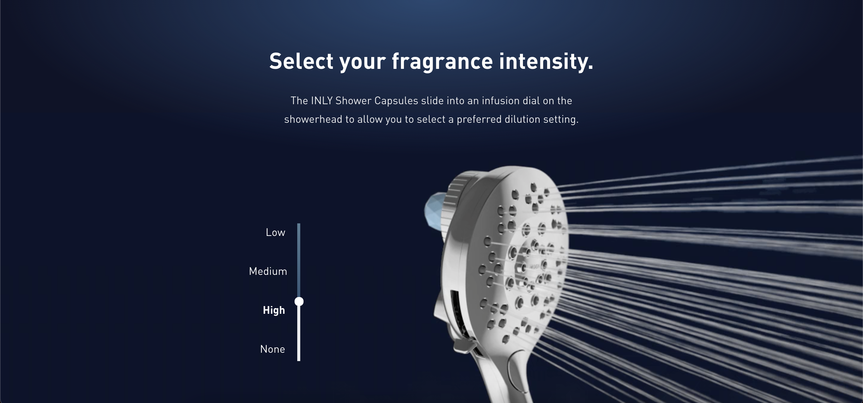 Source: Moen
This page by Moen is interactive and manages to delight users that visit the page for the first time. By scrolling through this page, the shower head shown in the example starts bursting water at different speeds. Constantly scrolling will change the speed from high, medium, and low. Not only does this brilliantly show off their product, it makes a two-dimensional page feel almost lifelike.
7. Microsites
Microsites blur the lines between a website and a landing page. It’s more like a mini web page with sections and sub-pages created within it but isn’t as robust as a full-blown website. Microsites also differ from websites by another factor: conversion goal.
Usually, microsites are set up for one purpose and encourage visitors to take one desired action. This is what sets them apart from a website, which has many overlapping goals associated with it and makes them fall under the umbrella of landing pages.
Driving traffic to landing pages
You can’t have conversions without any visitors. Let’s look at some ways businesses can drive traffic to their landing pages.
Paid search traffic
Advertising isn’t something new. Paid digital ads are a core part of digital marketing today. Decades ago, any paid ads that appeared on search engines would redirect visitors to the company’s website. A better approach would be to direct the incoming traffic to specific landing pages instead. We’ve established earlier that conversions aren’t the primary goal of a homepage. Sending visitors to a standalone page that doesn’t have outbound links to distract their buyer’s journey can maximize the potential of this traffic.
Since paid advertising involves copious amounts of research for targeting and retargeting purposes, analyzing which landing page would be a better fit for a particular campaign reduces bounce rates and increases the conversion rate significantly. The key is to create different landing pages for different campaigns.
This isn’t limited to the content of the landing page; campaigns can be region-specific, demographic-specific, or even industry-specific. Each landing page should reflect this variation as well.
Tip: Using a customer data platform helps marketers create well-rounded personas and buyer profiles for their next campaign.
Paid social traffic
Social media campaigns involve some of the most precise targeting methods than any other campaign. Marketing teams get detailed insight into their target audience’s interests, dislikes, social activity, and communities that they’re a part of. This is incredible information to have and use while building landing pages with dynamic content.
Let’s say your business is a creative automation platform. By searching for relevant hashtags across social media platforms like LinkedIn, Twitter, Instagram, or Facebook, you can find people actively looking for such a solution and their most pressing issue today. Launching paid social ads that include these hashtags ensures that the right set of people see your ad and click on your campaign. This way, your landing page gets hits from visitors that have high buying intent.
It’s also important to know which platforms your audience uses the most before creating campaigns and landing pages for that channel. For example, if your business is in the beauty industry, Instagram is your platform. Since Instagram is predominantly used on mobile phones, your landing page should be more focused on being mobile-friendly than desktop-friendly.
Email campaigns
No matter what anyone tells you, email isn’t dead.
Email campaigns and landing pages go hand-in-hand. Since email campaigns are sent out to a list of vetted contacts, the conversion rate is usually higher. This is why the return on investment (ROI) for any email campaign is significantly higher than any other campaign effort.
The best email campaigns are the ones that have segmented emails with tailor-made content. Don’t waste a prospect's time and take up extra space in their inbox by sending emails on events and updates they wouldn’t care about. The downside to a “paste and blast” method is that you run the risk of losing your email subscribers.
Keep your email content crisp and have a clear call to action within the email body. Adding too many links defeats the purpose of the campaign and dilutes its performance.
Organic search traffic
Let’s get one thing straight: organic doesn’t mean “free”.
You might not be shelling actual money on organic traffic efforts, but there’s a lot of thought and skills put into organic efforts.
Organic search traffic is the golden goose of traffic. The results are incredible if you can manage to find the “golden goose”. Organic traffic requires a solid search engine optimization (SEO) strategy in place before your landing page starts showing up somewhere toward the top of the search engine results page (SERP).
The best way to do this is by creating landing pages with good content. Search engines reward helpful and relevant information. Make sure your landing page respects design and copy requirements specific to your industry and watch that page rank better every day. It’s a slow process since it takes time for crawlers to read and assess your content before the search engine pushes it higher.
Outbound links
Not exactly a way to bring traffic into your landing page, but outbound links do affect how many visitors exit your page.
Too many links increase the chances of someone clicking and leaving. The number of links on your page should be equal to the number of conversion goals you have. Ideally, a landing page should have only one link: the call to action. Adding additional links like a footer, navigation bar, or links to other pages distracts a user from clicking on the correct CTA.
Top 5 landing page builders
Landing page builders enable non-technical users to deploy web pages designed to drive visitors to a specific conversion goal. Landing pages are usually designed to convert visitors to one specific action like signing up for a newsletter or a free trial or registering for a subscription service. Landing page builders make it easy for non-developers to test prototypes of pages to discover the impact and reaction of the buyers, customers, and website visitors.
To qualify for inclusion in the Landing Page Builders category, a product must:
- Provide ready-made layouts and design templates
- Connect to a current web page
- Enable front-facing page designs and interfaces to be modified for effortless site interoperability
- Incorporate current data to optimize conversion rates and email campaigns, and integrate with marketing platforms
*Below are the five leading landing page builders from G2's Spring 2021 Grid® Report. Some reviews may be edited for clarity.
1. HubSpot Marketing Hub
HubSpot Marketing Hub is a marketing automation platform that enables marketers to run complete inbound marketing campaigns at scale. Its landing page builders allow business teams to create and publish personalized landing pages that are compatible with different platforms.
What users liked:
“The email marketing and automated marketing elements are the areas I use most, and I happen to like them very much. The email service is robust and, at our account level, offers excellent A/B testing. Crafting an email is easy, which is good since I'm not technical. Once we send the email we get plenty of analytics on the back end to help improve our outreach.
The automation (workflows) requires some learning and time to set up initially, but once you've got the hang of it, this is time well spent. This automation opens up so many possibilities for the marketer.
Additionally, the HubSpot Academy offers high-quality guidance on not just using the platform, but also doing better marketing (in my case, I'm focused on the marketing).”
— HubSpot Marketing Hub Review, Jason R.
What users disliked:
“The only thing I dislike about the Marketing Hub is that it always overwrites our UTM codes when posting through their social media platform and when creating custom UTM through the Tracking URL Builder. UTM's should be custom to every organization and we leverage the naming convention different from the way they force you to use it.”
— HubSpot Marketing Hub Review, David P.
2. Mailchimp All-in-One Marketing Platform
Mailchimp’s all-in-one Marketing Platform allows businesses to build unlimited landing pages on a new or existing domain that remain consistent with their brand. Mailchimp automatically tags contacts based on their interests when they sign up on a landing page, ensuring that the audience base stays organized. Their drag-and-drop builder makes it simple to create landing pages that are compatible with any device.
What users liked:
“The most helpful feature about Mailchimp is the automation that can be created on it. There are other alternatives for Mailchimp as well but Mailchimp is the most popular and the most trusted one. It allows us to create the mail lists of our audience automatically through various integrations such as website popups, forms, and also API webhooks.
It can also create automated email triggers when a user is added to the list and also create automated drip campaigns of emails. It also provides us with actionable insights in the form of reports and it tracks pretty much everything that happens under the email campaign. It also has a free plan that allows us to use it but with limitations. It also creates well-looking landing pages that are connected to the lists so we don't need to have an actual website in order to collect leads.”
— Mailchimp All-in-One Marketing Review, Ritwik J.
What users disliked:
“The only downside about Mailchimp is pricing. If you have a ton of subscribers, it becomes pricey very fast but features it gives in return do have that value, and I think that pricing is reasonable. There is a very generous free plan. I think you can have about 1000 or 2000 email subscribers, and that is more than enough for small businesses, so if you are starting with email marketing, you really should check on Mailchimp.”
— Mailchimp All-in-One Marketing Review, Josip L.
3. ClickFunnels
ClickFunnels is a sales funnel platform where users can create sales pages and landing pages that convert visitors. Its landing page builder doesn’t require any tech, design, or coding experience. It boasts of hundreds of plug n’ play templates that don’t require any pre-requisite coding or tech experience to publish a landing page.
What users liked:
“It’s very simple to create landing pages, squeeze pages, and sales pages; they have a lot of pre-made templates that you need to edit a bit and are ready to use.
I also like the way that it is easy to share those funnels with your team and the fact that it’s easy to integrate them with WordPress.”
— ClickFunnels Review, Seki H.
What users disliked:
“The only complaint I would have is the amount of info/emails I received at the beginning. For someone who was completely new at the whole ClickFunnels thing, it made me panic. I think at the beginning, less should actually be more - to help the customer properly get used to the entire concept.”
— ClickFunnels Review, Sarah U.
4. ActiveCampaign
ActiveCampaign is a customer experience automation platform (CXA). With their landing page tool that’s connected to the CXA platform, businesses can send traffic to a page, turn page traffic into new contacts, and email personalized content to each contact. Their no-code builder allows users to create landing pages quickly.
What users liked:
“I have been using ActiveCampaign for less than a year now. This is a state-of-the-art communication and sales control program. I haven't seen all possibilities yet, but I started with the simple Start-up version and recently upgraded to the Plus version. The difference is considerable compared to other programs.
The possibilities seem to be far beyond what I’ve so far been able to discern. It is reliable and does not have a steep learning curve. I’m also very pleased with the help that ActiveCampaign is offering through their training programs. That allows you to get things going the way you want it, and it has made the difference for me to get my marketing comms up and running. I haven't looked at the sales and CRM too much yet, but I expect it will be in the same solid build I’m used to now.”
— ActiveCampaign Review, Swier M.
What users disliked:
“The login process is not intuitive and is more complicated than other platforms.
There is no automatic way to have contacts added to the database. I'd love Active Campaign to pick up emails from my Outlook account and populate automatically. At the moment, I manually type into a spreadsheet and Import. This is very time-consuming.”
— ActiveCampaign Review, Mark W.
5. SharpSpring
SharpSpring is a revenue growth platform that offers landing page and blog builders and integrations with hundreds of applications. With its point-and-click editor, users can create and publish landing pages instantly. SharpSpring allows users to personalize landing pages with dynamic content. The landing page creator enables businesses to create a series of linked pages designed to funnel visitors and prospects and transform them into leads.
What users liked:
“I am a 15-year marketing and advertising veteran. I have evaluated and purchased HubSpot, ActiveCampaign, Pardot, and more through the years. SharpSpring is by far the best combination of software and value. It has everything but for significantly less cost. The UI is expertly crafted into sales, marketing, and reporting sections. It's incredibly easy and intuitive to find what you need. Plus, if you have a question, you can Google what you are looking for and almost always find the answer in their help documentation very quickly.
The visual drag and drop email designer and landing page builder are excellent. The ability to easily create multi-page sales funnels is a unique and invaluable feature. Anyone evaluating marketing automation and CRM platforms should go to SharpSpring first, before looking at any other options. You won't be disappointed.”
— SharpSpring Review, Brian G.
What users disliked:
“There are some definite bugs such as data fields 'locking' when creating a landing page and later it becomes editable again. Strangely the design side of emails and landing pages is not cohesive. So you have a limited range of fonts in forms but lots of customization for colors for headings, then the reverse for landing pages. Things like buttons for GDPR can't currently be customized which looks odd.
Also, the onboarding process for Squarespace websites is different and this is not mentioned anywhere. Just needs to have someone invest some time to deal with all these issues and implement a decent upgrade.
Generally, all very minor things but stacked up can provide a bit more challenging onboarding process than what it needs to be.”
— SharpSpring Review, Darren W.
3, 2, 1...liftoff!
The key to a great landing page is personalization. Personalization is what makes the difference between a page with skippable content to a final destination that does what it’s intended to do: convert. Many marketers have been optimizing only half their campaigns. The majority of resources traditionally go to the pre-click stage.
For the sake of the users and for marketers, it’s time we treated landing pages as we do ads. Nobody wants to go to a barren grey rock – they want to go to the Moon.
Looking for new market opportunities? Check out this guide that helps businesses of any size find their next big win.