
Kelly Fiorini
Kelly Fiorini is a freelance writer for G2. After ten years as a teacher, Kelly now creates content for mostly B2B SaaS clients. In her free time, she’s usually reading, spilling coffee, walking her dogs, and trying to keep her plants alive. Kelly received her Bachelor of Arts in English from the University of Notre Dame and her Master of Arts in Teaching from the University of Louisville.
Last updated: August 10, 2026
What is a burndown chart?
A burndown chart is a line graph that plots remaining work against the time left to finish it. The vertical axis tracks that remaining work in tasks, hours, or story points; the horizontal axis tracks time. As the team completes work, the line trends toward zero, giving it a negative slope.
Agile software teams use product management software to build and track burndown charts alongside other planning work. Teams that use the agile methodology outside software development typically rely on project management software instead.
TL;DR: Burndown chart definition, types, and how to read it
A burndown chart tracks how much work remains in a sprint, release, or product backlog against how much time is left, with the line trending toward zero as work gets done. Reading one comes down to comparing the actual work line to the ideal work line: below it means ahead of schedule, above it means behind, and flat means the team is blocked.


What are the types of burndown charts?
Burndown charts come in three scopes: sprint, release, and product. Each covers a different span of work, from a single sprint up to an entire product backlog.
- Sprint burndown chart: The most common variant. It tracks progress within a single sprint, typically one to four weeks, showing how the sprint backlog shrinks day by day.
- Release burndown chart: Tracks work remaining across multiple sprints toward a release or large feature (sometimes called an "epic burndown chart"), helping forecast the delivery date.
- Product burndown chart: The broadest view. It tracks remaining work across the entire product backlog, covering every feature, user story, and task planned for the project.
How do you read a burndown chart?
Reading a burndown chart means comparing the actual work line to the ideal work line: below the ideal line means the team is ahead of schedule, above it means the team is behind, and a flat stretch means work has stalled.
- Actual line below the ideal line: The team is completing work faster than planned. A large, sustained gap can also mean the sprint was overestimated, so it's worth checking that too, not just celebrating.
- Actual line above the ideal line: More work remains than planned at this point, which puts the deadline at risk unless the team adjusts scope or effort.
- Actual line on the ideal line: The team is exactly on pace, the one case where nothing needs to change.
- A flat line or plateau: No work got logged as complete, which usually signals a blocker, a dependency, or scope creep that added unplanned work without updating the chart.
A simple example makes the pattern easier to spot. In a 10-day sprint starting at 40 story points, an ideal line drops by 4 points a day; if the actual line reads 38, 35, 31, 28 on days 2 through 5, the team is tracking slightly behind but close enough to catch up.
| Day | Ideal (points remaining) | Actual (points remaining) |
|---|---|---|
| 1 | 40 | 40 |
| 5 | 24 | 28 |
| 10 | 0 | 2 |
What are the elements of a burndown chart?
Every burndown chart shares four elements: the vertical axis, the horizontal axis, the actual work line, and the ideal work line.
- Vertical axis (Y-axis): Shows the work left to do, recorded as the number of tasks remaining or story points, a unit that estimates the effort needed to complete a user story or task.
- Horizontal axis (X-axis): Shows time. Days are the most common unit, though some charts use weeks for longer releases.
- Actual work line: The line that forms as the team records completed work each day. Also called the burndown line, it shows real progress toward the goal.
- Ideal work line: A straight diagonal line showing how much work the team needs to finish each day to stay on track. The team compares the actual line to this one to gauge progress.
Burndown chart vs. burnup chart
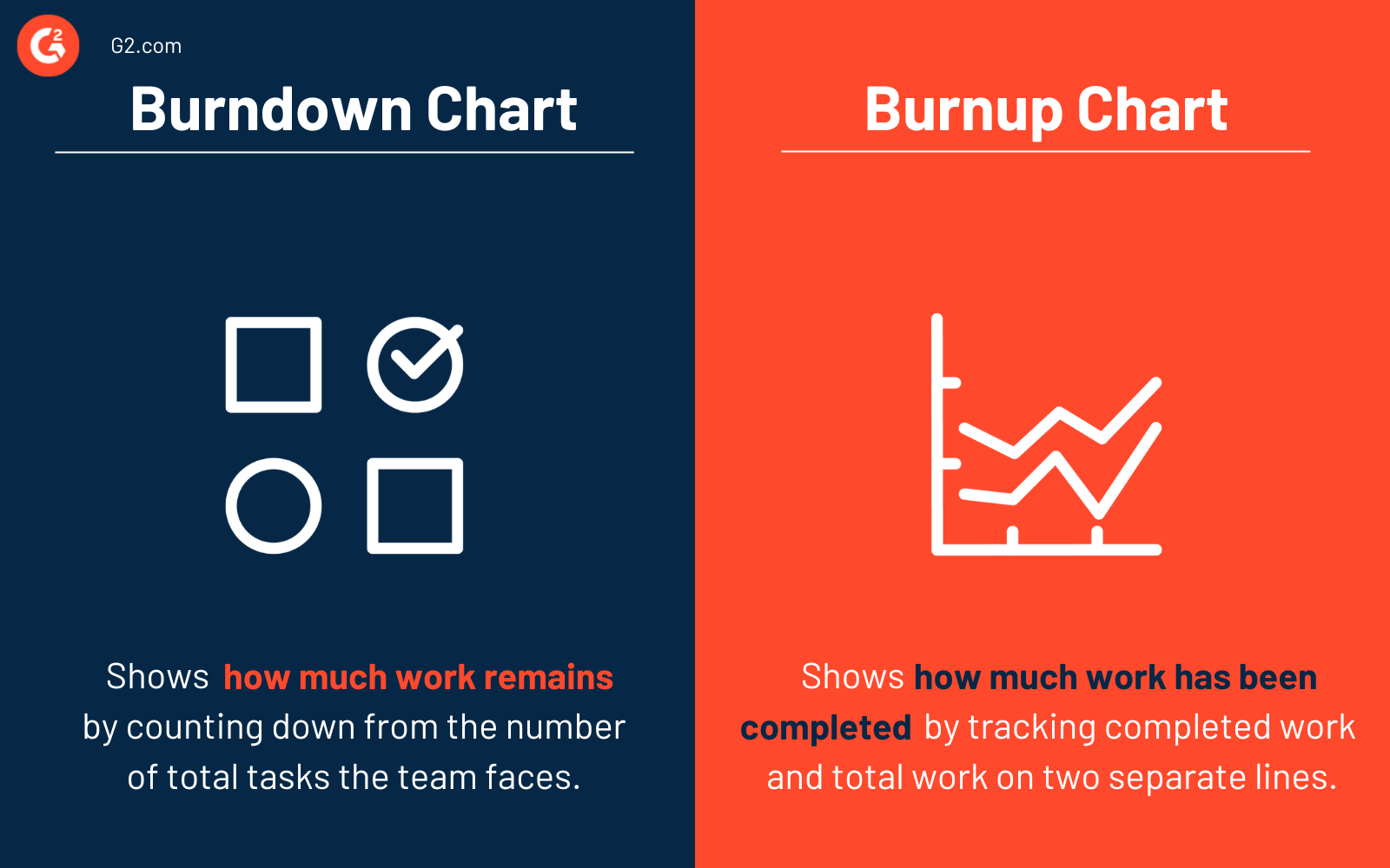
A burndown chart counts down remaining work toward zero; a burnup chart counts up completed work toward the total. Pick burnup when a team needs to see scope changes clearly, since its separate total-work line shows an added task immediately, something a burndown chart doesn't.
| parameters | Burndown chart | Burnup chart |
|---|---|---|
| What it tracks | Work remaining | Work completed |
| Line direction | Trends down to zero | Trends up to the total |
| Shows scope changes clearly | No: a scope increase just flattens or raises the line, which can look like stalled progress | Yes: the total-work line rises separately from the completed-work line, so an added task is visible immediately |
| Best for | Simple, at-a-glance sprint tracking | Projects where scope changes often and the team needs to see why the deadline moved |
What are the benefits of a burndown chart?
A burndown chart keeps the team on track, flags delays early, and gives everyone a shared view of progress.
- Keeps the team on track. It's an easy-to-read visual the team can check anytime to see how a sprint or project is going, and use as a starting point for talking through obstacles and adjustments.
- Predicts completion and flags delays early. Watching the gap between the actual and ideal lines lets a team spot a looming deadline miss days before it becomes a crisis.
- Encourages collaboration. The chart highlights progress toward a collective goal instead of individual output, which helps the team communicate and problem-solve together.
- Motivates the team. Watching the work line decline toward zero gives visible, day-by-day proof of progress.
What are burndown chart best practices?
Getting value out of a burndown chart comes down to three habits: making accurate estimates, updating the chart often, and actually analyzing what it shows.
- Make accurate estimates. The ideal line is only useful if it's based on a real baseline, such as the team's past velocity, current workload, and what they can realistically deliver in one sprint.
- Update the chart often. A burndown chart is only useful if it's current. Depending on the project, update it daily or weekly, and have the product or project manager review it with the team regularly.
- Analyze the chart, not just glance at it. Flatlines and other patterns point to a specific problem, such as a technical blocker or a distraction pulling the team away from sprint work. Discuss what caused it before the next sprint so it doesn't repeat.
Related resources:
Frequently asked questions about burndown charts
Common questions about burndown charts, answered.
Q1. What is the purpose of a burndown chart?
A burndown chart's purpose is to give a team a shared, at-a-glance view of how much work is left and whether they're on pace to finish by the deadline, so they can catch problems and adjust early instead of finding out at the end of a sprint.
Q2. How do you prepare a burndown chart?
Setting up a burndown chart takes four steps: total the work in tasks, hours, or story points; plot that total against available time to draw the ideal line; log completed work daily; and plot the actual line to compare against it. Most teams generate theirs automatically in Jira; others track it manually in Excel with a burndown chart template.
Q3. What's the difference between a burndown chart and a velocity chart?
A burndown chart tracks remaining work within a single sprint or release over time, while a velocity chart tracks how many story points a team completes per sprint, shown as a bar chart across multiple sprints. Burndown answers "are we on track right now," and velocity answers "how much can we realistically commit to next sprint," so teams typically use both together rather than choosing one.
Q4. Should you use a burndown chart or a Gantt chart?
Use a burndown chart for agile, iterative work where the goal is tracking remaining effort against time inside a sprint or release. Use a Gantt chart when a project has fixed deadlines, sequential task dependencies, and multiple teams that need a visual timeline, the kind of planning more common in waterfall project management.
Track team performance beyond a single sprint with G2's guide to 17 important agile metrics.


