Best Data Visualization Tools - Page 7

How Many Data Visualization Tools Products Does G2 Track?

Total Products under this Category: 478

Category Stats (Aug 2026)

  • Average Rating: 4.43/5 The average rating of products in this category, based on all submitted ratings
  • Top Trending Product: Supersimple (+0.89%) - Among all products in this category, Supersimple recorded the largest rating increase compared to last month

Last updated: August 04, 2026

How Does G2 Rank Data Visualization Tools Products?

Why You Can Trust G2's Software Rankings:

  • 30 Analysts and Data Experts
  • 26,100+ Authentic Reviews
  • 478+ Products
  • Unbiased Rankings

G2's software rankings are built on verified user reviews, rigorous moderation, and a consistent research methodology maintained by a team of analysts and data experts. Each product is measured using the same transparent criteria, with no paid placement or vendor influence. While reviews reflect real user experiences, which can be subjective, they offer valuable insight into how software performs in the hands of professionals. Together, these inputs power the G2 Score, a standardized way to compare tools within every category.

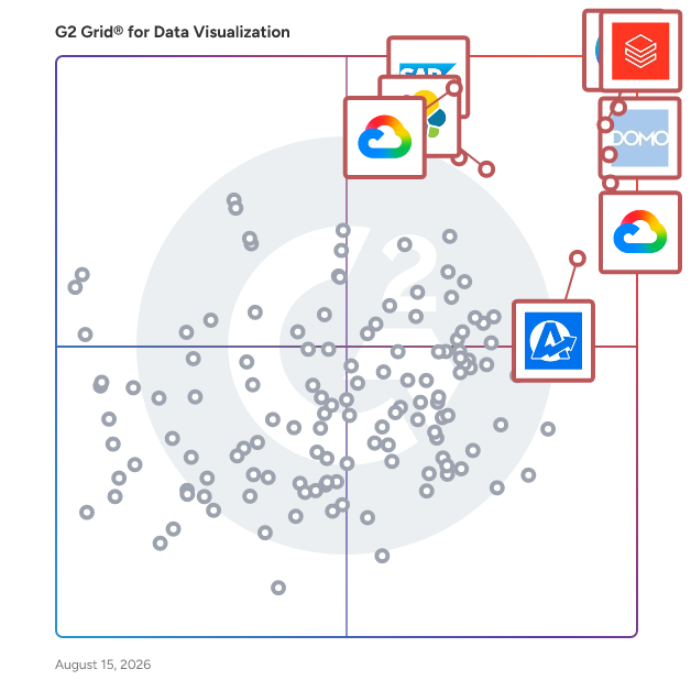
G2 Grid® for Data Visualization Tools

G2 Grid® for Data Visualization Tools plotting products by satisfaction and market presence

Highlighted products: Canva, Databricks, Domo, Looker, Data Studio, Elastic Stack, SAP HANA Cloud, and AgencyAnalytics.

Underlying data: [Grid® JSON](https://www.g2.com/categories/data-visualization-tools/grids.json?focus%5B%5D=canva&focus%5B%5D=databricks&focus%5B%5D=domo&focus%5B%5D=looker&focus%5B%5D=data-studio&focus%5B%5D=elastic-stack&focus%5B%5D=sap-hana-cloud-2025-10-01&focus%5B%5D=agencyanalytics)

Sponsored

Zoho Analytics

Zoho Analytics is a GenAI-powered self-service BI and analytics platform that helps businesses collect, prepare, analyze, and present insights from their data, all within minutes. Integrate with 500+ native data sources, like files, feeds, local and cloud databases, cloud storage, and popular business apps. Clean, transform, enrich, and catalog data with our agentic AI-powered, self-service data preparation and management capabilities. Create and manage complex ETL data pipelines using our visual pipeline builder, process stream data for real-time analytics, and set up a strong metrics layer for quality analysis and management. Zoho Analytics comes with 100+ domain-specific prebuilt reports and dashboards, pre-trained NLQ models, intelligently modeled and blended data across business applications, and lots more. Use our intuitive drag-and-drop visualization builder to build insightful and interactive reports and dashboards using a wide variety of visual components, like charts, widgets, pivot tables, tabular views and more. Generate customized reports and dashboards using simple, natural language with our AI-powered conversational agent, Zia. Ask Zia goes beyond basic reporting; it enables users to perform diagnostic analytics, forecast key metrics, and receive intelligent insights and recommendations. Users can assign tasks and trigger actions just by conversing with our agentic AI, Zia, streamlining their workflows and empowering data-driven decisions. Seamlessly embed Ask Zia into your custom or business applications to deliver contextual insights and actions. Enrich your analysis with automated insights by using our NLG-powered narration engine, Zia Insights. With diagnostic analytics for smarter decision-making, Zia Insights takes automated insights to the next level by bubbling up key drivers for particular business tasks. Enumerate complex business scenarios with what-if analyses, forecast KPIs, uncover trends and patterns with advanced analytical capabilities. Leverage cognitive analysis for keyword extraction and sentiment analysis, and more. Evaluate the best ML models with no-code assistance or develop custom models and functions using Python Code Studio. Zoho Analytics comes with pre-packed ML models (AutoML) that allow you to evaluate and pick the best model for your use case. Alternatively custom models and functions using Python Code Studio Embed our full-fledged analytics platform into other software applications. Craft and present immersive data stories through slideshows or purpose-built analytics portals. Collaborate securely through contextual comment threads and real-time messaging. Zoho Analytics has a robust set of APIs that enables elaborate customization and highly extensible low-code and no-code integration with any technology stack. It also offers a high degree of deployment flexibility (private, public, multi-cloud, and on-premises) and platform extensibility (professional services, partner support, and marketplace). Zoho Analytics is modern and scalable, and it can readily match growing data volumes and usage. Its time-tested and accredited enterprise-grade security features and governance framework ensure continuous data management and stewardship. On top of everything else, the TCO for Zoho Analytics—including licensing, implementation, customization, training, and support—is the lowest in our market.

Visit website

DashboardPack

DashboardPack offers a comprehensive collection of free and premium Bootstrap-based dashboard templates designed to streamline the development of web applications, SaaS platforms, and websites. These templates are crafted to provide modern, responsive, and user-friendly interfaces, enabling developers to create professional dashboards with ease. Key Features and Functionality: - Multiple Color Schemes: Each template includes built-in helpers that facilitate the creation of virtually unlimited color schemes for layout elements such as sidebars, headers, footers, and main content areas. Additionally, templates come with predefined color schemes for Bootstrap-based elements. - Multiple Layouts: Templates are bundled with various layout arrangements, including sample applications like Mailbox, FAQ Page, and Chat, providing flexibility in design and functionality. - Extensive Component Library: With over 200 customized components, widgets, and elements, the templates cater to a wide range of use cases for personal projects or client applications. - Scalable Assets Architecture: Assets are logically organized between NPM packages and local resources, with SCSS files allowing for easy inclusion or exclusion of stylesheets and customization from a single global point. - Easy Layout Modifiers: Templates offer straightforward options to modify layout components, such as fixing the sidebar or header on the screen, enhancing user experience and interface consistency. - Multiple Dashboard Designs: Each template includes multiple fully coded dashboard designs built using the included components and elements, allowing for easy customization and creation of unique dashboards. - Fully Responsive: Templates are designed to function seamlessly across various screen sizes, from low-end mobile phones to high-resolution displays, ensuring optimal performance and user experience. - Powered by Bootstrap 5: Templates are built on the latest version of Bootstrap, ensuring up-to-date components and elements. - Comprehensive Documentation: Each template comes with individual documentation files accessible both online and offline, providing detailed guidance for setup, customization, and usage. Primary Value and Solutions Provided: DashboardPack's templates significantly reduce development time and effort by offering ready-to-use, customizable dashboard solutions. They address common challenges in dashboard development, such as creating responsive designs, implementing consistent color schemes, and integrating various components. By leveraging these templates, developers can focus on core application functionality while ensuring a professional and polished user interface.

Average Rating: 4.4/5.0

Total Reviews: 30

How Do G2 Users Rate DashboardPack?

  • Has the product been a good partner in doing business?: 8.3/10 (Category avg: 9.0/10)
  • Dashboards: 8.7/10 (Category avg: 9.0/10)
  • Steps to Answer: 8.7/10 (Category avg: 8.6/10)
  • Formats: 9.2/10 (Category avg: 8.6/10)

Who Is the Company Behind DashboardPack?

  • Seller: AgileUI
  • HQ Location: N/A
  • Twitter: @AgileUI
    26 Twitter followers
  • LinkedIn® Page: www.linkedin.com
    1 employees on LinkedIn®

Who Uses This Product?

  • Top Industries: Information Technology and Services, Marketing and Advertising
  • Company Size: 43% Medium, 40% Small

What Do G2 Reviewers Say About DashboardPack?

AI-generated summary from verified user reviews

Pros
  • Users commend the ease of use of DashboardPack, making it simple to find and utilize desired dashboards.
Cons
  • Users find the limited font options restrictive, wishing for more design customization and visual effects.

What Are Recent G2 Reviews of DashboardPack?

Inforiver Analytics+

IBCS, Migration from legacy tools, 100+ chart, Tables, and KPI Cards Inforiver Analytics+ is the fastest way to visualize your data and share insightful stories in Microsoft Power BI as a Power BI Certified Visual. Analytics+ also enables large enterprises to migrate from Tableau, Spotfire, Qlik, Domo, Cognos, SAP Lumira, or their static PowerPoint dashboards from Think-cell or Mekko Graphics and consolidate them within Microsoft Power BI. The intuitive, no-code user experience (UX) enables even casual users to create comprehensive Storyboards in minutes, seamlessly integrating over 100 charts, cards, and tables into a unified visual presentation. Inforiver Analytics+ is your one-stop visual with the best performance among all custom visuals. It can render 10x more data points compared to native Power BI (30K data points Vs 1K - 3.5K data points). Inforiver Analytics+ is certified by IBCS and offers the most number of IBCS-certified templates, better performance, and flexibility over any other IBCS-certified software in the market.

Average Rating: 4.6/5.0

Total Reviews: 16

How Do G2 Users Rate Inforiver Analytics+?

  • Has the product been a good partner in doing business?: 8.3/10 (Category avg: 9.0/10)
  • Dashboards: 9.4/10 (Category avg: 9.0/10)
  • Steps to Answer: 9.1/10 (Category avg: 8.6/10)
  • Formats: 8.7/10 (Category avg: 8.6/10)

Who Is the Company Behind Inforiver Analytics+?

  • Seller: Inforiver
  • HQ Location: Plano, Texas
  • Twitter: @inforiverbi
    111 Twitter followers
  • LinkedIn® Page: www.linkedin.com
    9 employees on LinkedIn®

Who Uses This Product?

  • Company Size: 38% Small, 38% Medium

What Do G2 Reviewers Say About Inforiver Analytics+?

AI-generated summary from verified user reviews

Cons
  • Users experience poor customer support, often facing delays in response that hinder resolution of issues.

What Are Recent G2 Reviews of Inforiver Analytics+?

Appfire Dashboard Hub

What is Dashboard Hub? Dashboard Hub is an intuitive reporting solution that transforms your work management software into a centralized data hub. It lets users create and share custom dashboards with data from multiple sources and hosting platforms. Dashboard Hub is available in two apps: Dashboard Hub Pro for Jira Dashboard Hub for Confluence Purpose With Dashboard Hub, you can create a single source of truth where everyone can gain powerful business insights and stay aligned on what matters. Key Features - Custom charts: Create your own charts to gather and present data your way. - 15+ integrations: Centralize data from tools like Jira, Confluence, monday.com, and more. - Custom integrations: Add data from any REST/API to your dashboard. - ~100 pre-built metrics: Visualize key metrics such as Time in Status and Epic Progress, to name a few. - Quick and secure sharing: Keep access to sensitive data limited and safe thanks to advanced permissions and password protection. Benefits to Users Teams can tailor data visualization and reporting according to their unique needs – gaining key insights and centralizing management in a single place, avoiding data fragmentation. Thanks to advanced customization options, users can track any metrics in a manner that works best for them. Integrations help consolidate data from multiple sources while maintaining its reliability.

Average Rating: 4.3/5.0

Total Reviews: 23

How Do G2 Users Rate Appfire Dashboard Hub?

  • Has the product been a good partner in doing business?: 8.3/10 (Category avg: 9.0/10)
  • Dashboards: 9.4/10 (Category avg: 9.0/10)
  • Steps to Answer: 8.5/10 (Category avg: 8.6/10)
  • Formats: 9.0/10 (Category avg: 8.6/10)

Who Is the Company Behind Appfire Dashboard Hub?

  • Seller: Appfire
  • Company Website:
  • Year Founded: 2005
  • HQ Location: Boston, Massachusetts
  • Twitter: @Appfire
    1,632 Twitter followers
  • LinkedIn® Page: www.linkedin.com
    745 employees on LinkedIn®

Who Uses This Product?

  • Top Industries: Computer Software, Information Technology and Services
  • Company Size: 57% Medium, 22% Small

What Do G2 Reviewers Say About Appfire Dashboard Hub?

AI-generated summary from verified user reviews

Pros
  • Users value the ease of use of Appfire Dashboard Hub, enhancing their efficiency with customizable and centralized dashboards.
  • Users enjoy the ease of customization in Appfire Dashboard Hub, appreciating its user-friendly interface and options.
  • Users love the data visualization capabilities of Appfire Dashboard Hub, making analysis sharing and comprehension easier across teams.
  • Users value the flexibility and customizability of Appfire Dashboard Hub, enabling tailored dashboards for their unique needs.
  • Users value the centralized visibility of Appfire Dashboard Hub, streamlining data access for efficient project management.
Cons
  • Users find the learning curve steep, with complex setup and overwhelming customization for new users.
  • Users express concern over the limited customization options, which detracts from their overall experience with the app.
  • Users find the complex features overwhelming at first, creating a steep learning curve and challenging setup process.
  • Users find the initial setup complex, as advanced configurations and numerous options create a steep learning curve.
  • Users find the initial setup complex, leading to a steep learning curve for new users trying to customize.

What Are Recent G2 Reviews of Appfire Dashboard Hub?

What Are G2 Users Discussing About Appfire Dashboard Hub?

Datapad

Datapad is a no-code reporting platform. It helps any business integrate with 15+ sources in an instant, consolidate their data in a singel location and collaborate with their teams & clients. The tool excels in its ease-of-use, design and simplicity. Some highlighted features are: - 15+ integrations - Metric & dashboard templates - AI Insight generation - Google Sheets chart builder - Dashboard links & embedding - Daily e-mail scorecards - Team KPI collaboration

Average Rating: 4.2/5.0

Total Reviews: 34

How Do G2 Users Rate Datapad?

  • Has the product been a good partner in doing business?: 8.3/10 (Category avg: 9.0/10)
  • Dashboards: 9.1/10 (Category avg: 9.0/10)
  • Steps to Answer: 8.3/10 (Category avg: 8.6/10)
  • Formats: 8.5/10 (Category avg: 8.6/10)

Who Is the Company Behind Datapad?

  • Seller: Datapad
  • Year Founded: 2022
  • HQ Location: San Francisco | Remote, US
  • LinkedIn® Page: www.linkedin.com
    4 employees on LinkedIn®

Who Uses This Product?

  • Top Industries: Computer Software
  • Company Size: 62% Small, 29% Medium

What Are Recent G2 Reviews of Datapad?

FusionCharts

FusionCharts is a leading data visualization company that provides a wide range of interactive charts and maps to businesses and organizations worldwide. It has quickly grown in popularity because of its innovative and powerful charting solutions. FusionCharts is known for its high-quality and user-friendly products, which are used by various industries including finance, healthcare, and technology. The company's flagship product, FusionCharts Suite XT, is a JavaScript charting library that allows developers to easily create interactive and visually appealing charts for web and mobile applications. Today, FusionCharts Suite XT is used by over 800,000 developers across 28,000 companies in over 120 countries, including some well-known Fortune 500 companies. FusionCharts product suite consists of FusionCharts Suite XT - FusionCharts XT - Create interactive and responsive charts & dashboards for your web & mobile projects - FusionWidgets XT - Track your KPIs and real-time data in dashboards; - PowerCharts XT - Advanced widgets for domain-specific usage - FusionMaps XT - Offers over 2000+ geographical maps FusionTime - Visualize time series and stock data in JavaScript FusionExport - Convert your live dashboards to PDF or images FusionGrid - Rocket fuel for data-intensive applications with integrated charting Some of the key features and functionality of FusionCharts include: Interactive Charting: Create charts and dashboards for internal reporting by utilizing charting solutions such as drag-able charts, scroll charts, self-updating charts, manipulation options, and visual data selection. Time-Series Visualization: Explore visualizations from any time window by zooming in on axes to reveal specific information. Customized Data Plots: Highlight data plots, apply gradient effects, change plot colors, and more to gain relevant insights. Trendlines: Trendlines such as vertical and horizontal reference lines can be used to understand data. Data can be analyzed across several functions using trendline charts, regression lines, vertical lines, and gauges. Export Files: Maps, gauges, and charts can be exported in a variety of formats, including images, Excel spreadsheets, and PDF files. Customize the export process by displaying the exported file names in the export menu. Space Management: Save space by organizing charts in a systematic fashion. Stack and vertically align charts to organize pages. Annotations: Attract the attention of visitors using various annotations such as pictures, lines, or text on charts. It draws user attention by emphasizing comprehensive information for visitors. Integration: Client-side charts can be updated through its open-source, front- and back-end integrations.

Average Rating: 4.4/5.0

Total Reviews: 34

How Do G2 Users Rate FusionCharts?

  • Has the product been a good partner in doing business?: 8.4/10 (Category avg: 9.0/10)
  • Dashboards: 9.2/10 (Category avg: 9.0/10)
  • Steps to Answer: 8.3/10 (Category avg: 8.6/10)
  • Formats: 9.2/10 (Category avg: 8.6/10)

Who Is the Company Behind FusionCharts?

  • Seller: Idera, Inc.
  • Year Founded: 2007
  • HQ Location: Austin, US
  • Twitter: @MigrationWiz
    482 Twitter followers
  • LinkedIn® Page: www.linkedin.com

Who Uses This Product?

  • Top Industries: Computer Software, Financial Services
  • Company Size: 60% Small, 26% Medium

What Are Recent G2 Reviews of FusionCharts?

What Are G2 Users Discussing About FusionCharts?

SAS/Graph

SAS/GRAPH is a software that creates and delivers accurate, high-impact visuals that enable decision makers to gain a quick understanding of critical business issues.

Average Rating: 4.1/5.0

Total Reviews: 25

How Do G2 Users Rate SAS/Graph?

  • Has the product been a good partner in doing business?: 8.7/10 (Category avg: 9.0/10)
  • Dashboards: 8.9/10 (Category avg: 9.0/10)
  • Steps to Answer: 9.0/10 (Category avg: 8.6/10)
  • Formats: 8.9/10 (Category avg: 8.6/10)

Who Is the Company Behind SAS/Graph?

  • Seller: SAS Institute Inc.
  • Year Founded: 1976
  • HQ Location: Cary, NC
  • Twitter: @SASsoftware
    60,863 Twitter followers
  • LinkedIn® Page: www.linkedin.com
    18,638 employees on LinkedIn®
  • Phone: 1-800-727-0025

Who Uses This Product?

  • Top Industries: Research
  • Company Size: 42% Small, 31% Large

What Are Recent G2 Reviews of SAS/Graph?

What Are G2 Users Discussing About SAS/Graph?

Dynamic AI

Dynamic AI is for people that need easy-to-consume, summarized, on-demand information to make fast, reliable business decisions. Details, when needed, are a click away. From the boardroom to the marketing department or shop floor, decisions drive business. Dynamic AI’s accurate, interactive, real-time information empowers people to make fast, reliable decisions.

Average Rating: 4.2/5.0

Total Reviews: 43

How Do G2 Users Rate Dynamic AI?

  • Has the product been a good partner in doing business?: 8.5/10 (Category avg: 9.0/10)
  • Dashboards: 8.1/10 (Category avg: 9.0/10)
  • Steps to Answer: 8.2/10 (Category avg: 8.6/10)
  • Formats: 7.7/10 (Category avg: 8.6/10)

Who Is the Company Behind Dynamic AI?

Who Uses This Product?

  • Top Industries: Information Technology and Services, Computer Software
  • Company Size: 50% Small, 43% Medium

What Are Recent G2 Reviews of Dynamic AI?

Mevisio

Mevisio is a digital platform for data visualization and teamwork. As an enterprise cloud service for organizations working with Lean, it gives you the opportunity to digitize your visual management - going from old-fashioned whiteboards to modern touch screens.

Average Rating: 4.5/5.0

Total Reviews: 25

How Do G2 Users Rate Mevisio?

  • Has the product been a good partner in doing business?: 8.8/10 (Category avg: 9.0/10)
  • Dashboards: 9.2/10 (Category avg: 9.0/10)
  • Steps to Answer: 8.4/10 (Category avg: 8.6/10)
  • Formats: 8.6/10 (Category avg: 8.6/10)

Who Is the Company Behind Mevisio?

  • Seller: Mevisio
  • Year Founded: 2017
  • HQ Location: Stockholm, Sweden
  • LinkedIn® Page: linkedin.com
    16 employees on LinkedIn®

Who Uses This Product?

  • Top Industries: Information Technology and Services
  • Company Size: 52% Medium, 41% Small

What Are Recent G2 Reviews of Mevisio?

Statsbot

Statsbot is helping you take control of your raw data, providing an all-in-one analysis tool for engineers and non-tech folks alike. Statsbot’s simple dashboards, seamless Slack integration, and premier customer service are helping teams everywhere get more out of their data. We’re experts in data analytics: we’re sharing not only a powerful tool but our industry expertise. Our platform is used by growing companies like Giphy to glean insights from billions of data points. Statsbot's key features for business users: - Insights. Business users can explore data on their own without the need to send requests to data analysts. Now everyone at your company can build complex reports, drill down to every record, and slice and dice data however they want. - Dashboards. Statsbot’s dashboards are always up to date, no need to load new data exports or wait hours before it loads. We use background caching to make your dashboards load extremely fast. - Smart Alerts. Statsbot can send you automated reports and smart alerts about spikes in certain metrics. For example, when a number of users suddenly goes up or down. You’ll never miss when something goes wrong (or really right) and can take immediate action. - Schedule reports to check metrics on a regular basis. It’s great to have real time metrics every morning, especially for non-technical people. - Share metrics fast and easy. You can share your data insights with the whole team, partners or investors right in a work chat, such as Slack or Hangouts. No matter which device. The benefits for data analysts: - Bring all data into one place. Statsbot works with terabytes of raw data from hundreds of data sources. You don’t need to optimize or transform data beforehand. -Transformation engine. Define your transformations using SQL and Javascript. No need to learn proprietary languages or navigate complex interfaces. - Statsbot is designed to work with Big Data. Data storage is cheap, but querying data is expensive. Statsbot makes your queries cost effective using a pre-aggregations layer on top of your data. - No ad hoc SQL. No need to write ad hoc SQL queries for every business request. Create a single source of truth across the organization and let your business users explore data themselves.

Average Rating: 4.7/5.0

Total Reviews: 16

How Do G2 Users Rate Statsbot?

  • Has the product been a good partner in doing business?: 9.5/10 (Category avg: 9.0/10)

Who Is the Company Behind Statsbot?

  • Seller: Statsbot
  • Year Founded: 2016
  • HQ Location: San Francisco, CA
  • Twitter: @statsbotco
    793 Twitter followers
  • LinkedIn® Page: www.linkedin.com

Who Uses This Product?

  • Company Size: 63% Small, 38% Medium

What Are Recent G2 Reviews of Statsbot?

What Are G2 Users Discussing About Statsbot?

CentriQS

CentriQS offers small business management software and custom database solutions for small and medium enterprise businesses. Centralize all the data across your entire company.

Average Rating: 3.7/5.0

Total Reviews: 11

How Do G2 Users Rate CentriQS?

  • Has the product been a good partner in doing business?: 10.0/10 (Category avg: 9.0/10)
  • Dashboards: 8.1/10 (Category avg: 9.0/10)
  • Steps to Answer: 8.0/10 (Category avg: 8.6/10)
  • Formats: 8.5/10 (Category avg: 8.6/10)

Who Is the Company Behind CentriQS?

Who Uses This Product?

  • Company Size: 55% Small, 27% Medium

What Are Recent G2 Reviews of CentriQS?

Slemma

Slemma is a simple, yet powerful, reporting tool designed for businesses. Slemma enables users to view, analyze and share all of their data – from data warehouses, data storage providers and cloud service solutions – in one place.

Average Rating: 4.4/5.0

Total Reviews: 27

How Do G2 Users Rate Slemma?

  • Has the product been a good partner in doing business?: 9.1/10 (Category avg: 9.0/10)

Who Is the Company Behind Slemma?

  • Seller: Slemma
  • Year Founded: 2013
  • HQ Location: Los Angeles, California
  • Twitter: @slemma
    6 Twitter followers
  • LinkedIn® Page: www.linkedin.com
    6 employees on LinkedIn®

Who Uses This Product?

  • Company Size: 74% Small, 19% Medium

What Are Recent G2 Reviews of Slemma?

What Are G2 Users Discussing About Slemma?

Dataflo

Dataflo is a data-driven marketing intelligence platform that helps marketers and sales professionals make smarter decisions. It's affordable and easy to use to gain insight into your marketing efforts. With Dataflo, you can view your data analytics unified from tools such as HubSpot CRM, HubSpot Marketing, Google Analytics, Youtube, Facebook Ads, Linkedin Ads, Twitter, Stripe, and Intercom in one single place within few clicks. Get data on the areas that matter most: optimizing spend, closing new deals, driving traffic to conversion funnels, identifying the best sources of leads, and improving customer experience. One-touch integration with Hubspot lets you combine data from any source and visualize data using pre-built dashboards to improve your analysis. Unified Custom Dashboard: Manage your data reports easily. Integrations are available with all major SaaS tools, including Hubspot, Google Analytics, Google/Facebook Ads, Mailchimp —even subscription software! It only takes a few minutes to compile the data you need and make it available to the whole team. You'll be amazed at how much time is saved, how much information is easily accessible, and how your meetings come together better. Paid Attribution Template: Get all the important ad metrics in one place to get greater performance visibility into your paid marketing activities and make more informed decisions without having to build reports from scratch. Understand impressions, clicks, and CTR for each campaign and provide information on how many leads are converted from there. Easily calculate ROI and place bets based on channels/sources across your campaigns. Slack Command Center: Use simple slash command to get insights inside your Slack channel. Automate and schedule reports so that you are always aware of the peaks and troughs in your business performance. Make collaboration smarter and easier by sharing on-point report cards that highlight relevant and actionable data to your team.

Average Rating: 4.5/5.0

Total Reviews: 19

How Do G2 Users Rate Dataflo?

  • Has the product been a good partner in doing business?: 7.5/10 (Category avg: 9.0/10)
  • Dashboards: 9.4/10 (Category avg: 9.0/10)
  • Steps to Answer: 8.8/10 (Category avg: 8.6/10)
  • Formats: 8.8/10 (Category avg: 8.6/10)

Who Is the Company Behind Dataflo?

  • Seller: Dataflo
  • Year Founded: 2021
  • HQ Location: Chennai, IN
  • LinkedIn® Page: www.linkedin.com
    3 employees on LinkedIn®

Who Uses This Product?

  • Top Industries: Information Technology and Services
  • Company Size: 42% Medium, 42% Small

What Do G2 Reviewers Say About Dataflo?

AI-generated summary from verified user reviews

Pros
  • Users value Dataflo's consolidated analytics, streamlining reporting and enhancing visibility into vital performance metrics.
  • Users appreciate the collaborative sharing features of Dataflo, which streamline reporting and enhance team communication effectively.
  • Users value Dataflo for its efficiency in consolidating metrics, greatly simplifying reporting and collaboration tasks.
  • Users value the intuitive dashboard usability of Dataflo, enhancing reporting efficiency and collaboration across teams.
  • Users value Dataflo's data visualization, efficiently consolidating metrics and enhancing reporting with intuitive dashboards and integrations.
Cons
  • Users experience delays due to slow performance with large datasets, complicating dashboard refreshes and data access.
  • Users find the difficult learning curve for Dataflo makes onboarding and tool familiarization time-consuming and challenging.
  • Users find the steep learning curve of Dataflo challenging, complicating onboarding and initial familiarity with the tool.
  • Users note a limited feature set, making onboarding and utilizing Dataflo more challenging, especially for new users.
  • Users find the performance efficiency lacking, especially with slow processing of large datasets and complex integrations.

What Are Recent G2 Reviews of Dataflo?

Ardoq

Ardoq is the smarter way to EA, enabling organizations to automatically visualize their entire IT landscape by connecting live data from applications, systems, and business processes. Unlike traditional EA tools, Ardoq replaces static diagrams with connected, dynamic, and data-driven insights, helping teams map dependencies, model future-state scenarios, and align strategy with execution. By integrating real-time system data and crowdsourcing intelligence from stakeholders, Ardoq ensures architecture remains accurate, actionable, and accessible across the enterprise. Whether rationalizing applications, planning transformation, or optimizing IT spend, Ardoq helps teams make smarter decisions with confidence.

Average Rating: 4.5/5.0

Total Reviews: 32

How Do G2 Users Rate Ardoq?

  • Has the product been a good partner in doing business?: 8.8/10 (Category avg: 9.0/10)
  • Dashboards: 8.3/10 (Category avg: 9.0/10)
  • Steps to Answer: 8.3/10 (Category avg: 8.6/10)
  • Formats: 8.5/10 (Category avg: 8.6/10)

Who Is the Company Behind Ardoq?

  • Seller: Ardoq
  • Year Founded: 2013
  • HQ Location: Oslo, Oslo
  • LinkedIn® Page: www.linkedin.com
    286 employees on LinkedIn®

Who Uses This Product?

  • Top Industries: Retail
  • Company Size: 42% Large, 30% Medium

What Do G2 Reviewers Say About Ardoq?

AI-generated summary from verified user reviews

Pros
  • Users value the user-friendly interface of Ardoq, enhancing clarity and collaboration in complex organizations.
  • Users appreciate the user-friendly interface of Ardoq, finding it intuitive and feature-rich for easy navigation.
  • Users value the transparency and collaboration facilitated by Ardoq, enhancing alignment within complex organizations.
  • Users appreciate the user-friendly interface and extensive features of Ardoq, enhancing their overall experience.
  • Users value the flexibility of Ardoq, enabling tailored metamodels and seamless data integration for insightful analysis.
Cons
  • Users note a steep learning curve for Ardoq, suggesting improvements in onboarding and user guidance for better adoption.
  • Users often find Ardoq to be expensive, with high operational costs and limited access to the free version.
  • Users find the learning difficulty of Ardoq challenging, indicating a need for improved onboarding and guidance.
  • Users find complexity in Ardoq's operations, especially regarding the accessibility of the free version.

What Are Recent G2 Reviews of Ardoq?

DataLion

DataLion is a web-based software that takes data-driven decisions in your company to the next level. Whether you’re working with marketing, HR, consumer or finance data, DataLion enables you to create powerful interactive dashboards within minutes. To make working with data simple, we have developed AI algorithms to understand and analyze your data. No more emailing of xls. files. Just set up your data workflow in DataLion, create your reports per drag & drop, and boost your creativity with hundreds of visualization widgets. You can export presentations with embedded data, using your own template. The award-winning DataLion software is already used by a large number of companies from retail, telecoms, finance and automotive.

Average Rating: 4.5/5.0

Total Reviews: 16

How Do G2 Users Rate DataLion?

  • Has the product been a good partner in doing business?: 9.6/10 (Category avg: 9.0/10)
  • Dashboards: 9.0/10 (Category avg: 9.0/10)
  • Steps to Answer: 9.2/10 (Category avg: 8.6/10)
  • Formats: 8.9/10 (Category avg: 8.6/10)

Who Is the Company Behind DataLion?

  • Seller: DataLion
  • Year Founded: 2014
  • HQ Location: Munich, Bavaria
  • Twitter: @DataLion_EN
    638 Twitter followers
  • LinkedIn® Page: www.linkedin.com
    3 employees on LinkedIn®

Who Uses This Product?

  • Top Industries: Market Research
  • Company Size: 56% Small, 44% Medium

What Do G2 Reviewers Say About DataLion?

AI-generated summary from verified user reviews

Pros
  • Users value the customer support of DataLion, appreciating the real people ready to assist them effectively.
  • Users commend the ease of use of DataLion, appreciating its intuitive design and responsive support team.

What Are Recent G2 Reviews of DataLion?

What Are G2 Users Discussing About DataLion?

Qalyptus

Qalyptus is a powerful and effective reporting platform. Qalyptus is flexible and allows you to create custom reports from Qlik Sense SaaS, Qlik Sense Client-Managed, and QlikView in various formats: Excel, Word, PowerPoint, PDF, HTML, and more. Using a drag-and-drop interface, create reports for unlimited recipients without additional cost. Reports can be delivered by email, stored in folders, published on the Web, Qalyptus Cloud is a 100% cloud product for Qlik Sense SaaS. Qalyptus Server is a 100% On-premise product for Qlik Sense Client-Managed.

Average Rating: 4.6/5.0

Total Reviews: 30

How Do G2 Users Rate Qalyptus?

  • Has the product been a good partner in doing business?: 9.8/10 (Category avg: 9.0/10)
  • Dashboards: 9.0/10 (Category avg: 9.0/10)
  • Steps to Answer: 7.6/10 (Category avg: 8.6/10)
  • Formats: 9.2/10 (Category avg: 8.6/10)

Who Is the Company Behind Qalyptus?

  • Seller: Qalyptus
  • HQ Location: Lyon
  • Twitter: @qalyptus
    66 Twitter followers
  • LinkedIn® Page: www.linkedin.com
    4 employees on LinkedIn®

Who Uses This Product?

  • Company Size: 57% Small, 27% Medium

What Are Recent G2 Reviews of Qalyptus?

What Are G2 Users Discussing About Qalyptus?

Bijou Barry
BB
Researched and written by Bijou Barry
Updated June 24, 2026