

Emily Goorevich
Emily Goorevich is a former content marketing intern at G2, and currently works as an SEO Specialist at L2TMedia. She is originally from Maryland, and loves reading, listening to podcasts, and eating falafel.
Are you ready to take your stick figure drawings to the next level?
Don’t get too ambitious just yet – first, you’ll need to understand the elements of art.
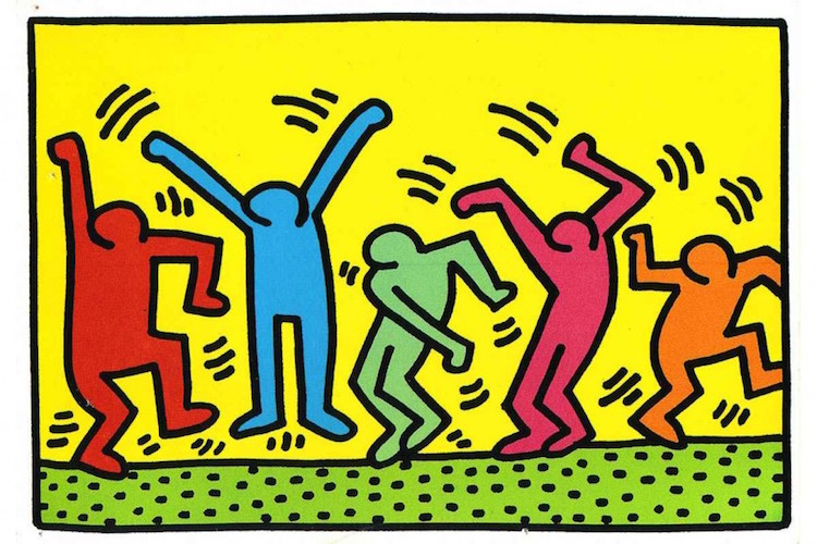
Think of the elements of art as building blocks, just as much for traditional creations as for digital ones made in drawing software. Whether hand-drawn or created on a computer, nearly every piece of art intends to communicate a message or evoke emotion. A strong understanding of these elements is valuable for artists and graphic designers. The choices made regarding line, shape, color, and so on greatly impact how a composition is perceived, assessed, and used.
Elements of art
Whether you're a seasoned artist wielding a brush or a budding designer working in drawing software, the elements of art are your fundamental tools. Just like bricks and mortar form the foundation of a house, these elements act as the building blocks for any visual creation.
By understanding how these elements work together, you'll gain the power to craft captivating compositions, guide the viewer's eye, and ultimately tell your unique visual story.
What are the 7 elements of art?
- Line
- Shape
- Color
- Typography
- Texture
- Size
- Space
1. Line
Take a look around, and you’ll find examples of lines everywhere. It seems impossible to imagine design without utilizing lines in some form, which is why lines are considered the foundation of all art and the most versatile element of design.
Simply put, a line is an identifiable path created by a point moving in space. However, there is nearly endless potential when it comes to using the design element of line. They often lead a viewer's eye around composition and can communicate messages through their distinct qualities.
Lines vary in width, length, and direction. When used strategically, these variations can elicit certain psychological responses in a viewer. For example, a curvy line can suggest comfort and ease, whereas a jagged one can evoke anxiety and commotion.
Most often, lines define the edges of a form. Through contouring, however, lines are able to give the effect that an object is three-dimensional. The process of contouring is created by drawing parallel lines that follow the form of an object. To create solid areas you can vary the line thickness and distance.
Want to learn more about Drawing Software? Explore Drawing products.
2. Shape
Shapes, like lines, are all around us. From a young age, you learn how a pizza resembles a triangle and a circle mirrors the shape of a cookie. Now that you’re hungry, you can see how strategically choosing certain shapes can send subliminal messages to an audience.
In art, line and shape almost always go together and have many of the same qualities. Shapes play an important role in the creation of art. Different characteristics of shapes evoke different moods and meanings. They are also an important element of design in space since they create movement within a piece and lead the eye from one design element to the next.
Shapes are typically two-dimensional, meaning they only have length and width. However, not all shapes will be classified as the same type. You can classify shapes either as geometric or organic and also define shapes by being positive or negative. Depending on the message and intention of the artist, each shape will uniquely take on the characteristics of these different classifications

3. Color
I’m sure you’ve all been asked “What’s your favorite color?” Even if you’re not aware of it, color has the ability to have a tremendous affect on our emotions, mood, and even appetite. Artists and designers have an understanding of color theory and deliberately use color to influence the habits of consumers.
What your eyes see as color is really just perception. For instance, when you look up a the sky and see the color blue, what’s really going on is that data is being sent from our eyes to our brains in the form of wavelengths. These wavelengths tell us that the color of the sky is blue.
Colors have three main characteristics— hue (blue, red, green, etc.), value (spectrum of light and dark) and intensity (spectrum of bright and dark) — all contributing to what the color communicates and how it is used. Artists vary the value and intensity of color to create contrast within a composition.
The color wheel is used to classify colors into three categories: primary (red, yellow, green), secondary (green, orange, purple), and tertiary (red-violet, blue-green, etc.). By drawing a line through the middle of color wheel you are able to separate warm colors (reds, oranges, yellows) from the cool (blue, greens, purples). It is important to understand the temperature distinction between these two categories since warm colors are typically associated with energy and action while cool colors are associated with peace and serenity. Designers also use the color wheel to create a color scheme, which should either be complementary, analogous, or triadic.
How colors contrast, mix, match, and potentially clash, is an important aspect of design that artists must take into consideration. Unfortunately, the wrong combination of colors can communicate an unintended message to viewers.
4. Typography
Imagine you are reading the words “love” and “hate” side by side. I’m sure upon seeing these two words, different emotions arise. Now, visualize that “love” is written in sharp, black lettering and “hate” is presented in a thin, pink cursive. Do you still have the same connotative association as before?
The choices that designers make with the element of typography has the ability to convey emotion and meaning within a piece of art. Typography incorporates other elements of art, such as sizing, color, and spacing, to communicate an intended message. Hierarchy— the way you lay out text— is another key element of typography. Through visual hierarchy, you can lead the viewer's eye to the parts of the text are the most important – the largest texts calling more attention than the smaller.
When you were imagining the visual display of the words love and hate, you were envisioning the choices related to the font. In art, font decisions have a significant impact on the overall look and feel of a composition. It is important to think of the message you are intending to portray with the element of typography since, just as with the love and hate example, it can change a viewer’s perception of a piece.


5. Texture
Texture in art appeals to our sense of touch, which can evoke feelings of nostalgia, delight, and discomfort. While you can’t actually feel a two-dimensional design, artists utilize texture to give viewers a visual perception of what that experience would be like.
Texture is everywhere and there are endless ways to describe it. You learn from a young age what it means for something to be rough, smooth, fuzzy, etc. For designers, however, it is much more complicated to create this sensation in a two-dimensional composition. The illusion of texture is created by using other elements of art such as color, line, and shape as a tool to draw a viewer’s attention and create balance within a composition.
There are many ways to categorize texture, but the main two forms are actual and visual. Actual, or physical texture, refers to the real tactical properties of a design. Think about this type of texture in terms of designing a wedding invitation – the thickness, weight (heavy or light), and feeling of the paper (smooth, rough, etc.), along with additional embellishments (glitter, flowers, etc.), all contribute to the overall feeling or mood about the invitations design. Visual texture is the illusion of texture, created by other design elements. Examples of this can be seen in photographs, paintings, and drawings. Designers will often utilize graphic design software to create the illusion of visual texture.

6. Size
Think about a piece of art – wouldn’t it be boring if every shape and object in the composition was the same size? Size, which is commonly associated with scale, is an important tool for artists to add emphasis and interest to their designs.
The psychology behind size is an important aspect of this element of design. When an object is larger or more grand in comparison to objects, the more power and weight it carries. Like many other elements of art, sizing is essential to communicate a message or story. While in some areas size can create greater contrast and interest, it can also help to better express an idea.

7. Space
In art, space refers to how a piece of artwork is organized – the area above, below, and within components of a piece. The relationship between these areas — foreground, background, and middle ground — is strategically utilized by artists to give the illusion of depth to a flat surface.
Just as with shapes, space can be positive or negative and the relationship between the two is important for artists to successfully communicate meaning within their composition. Positive space can be described as the subject, while negative space is the area around and within it. One you have too much of either positive or negative space, it can throw off the balance and rhythm of a piece of art. The contrast between positive and negative space will create balance. To create rhythm, artists will alternate between positive and negative space by repeating shapes within the composition.

5 pro tips for mastering the elements of art
Mastering the elements of art is like building a strong foundation. These elements - line, shape, form, space, color, value, and texture - are your tools to create impactful visuals. Here's how to use them effectively:
1. Understand their language: Each element conveys emotions. Bold lines suggest power, while soft curves evoke calmness. Warm colors radiate energy, cool colors bring peace. Learn the "language" of each element to express your message clearly.
2. Use contrast strategically: Play opposites! Place a dark value next to a light one to make them pop. Use complementary colors and color schemes to create a vibrant spark. This contrast draws the viewer's eye and emphasizes key elements.
3. Create harmony through repetition: Repetition creates a sense of unity. Echo shapes, colors, or patterns subtly throughout your artwork. This creates a pleasing flow and guides the viewer's exploration.
4. Don't forget negative space: The space around objects matters! Use it to balance your composition and define shapes positively. It can be as impactful as the elements themselves.
5. Experiment and have fun! Art thrives on exploration. Don't be afraid to break the rules. Experiment with unexpected combinations and see what emerges. Remember, practice makes perfect, so keep exploring and refining your artistic voice!
Time to get started!
Professional artists incorporate and consider all of these elements, along with the principles of design, when they create their compositions. As you can see, subtle changes, such as the curve of a line or an adjustment of color, can completely skew the overall mood of a design. When the elements of art are used effectively and cohesively, they can be powerful tools for artists and designers to express meaning and emotion.
Want to learn how to apply these elements of art to graphic design? Check out this article on the 7 types of graphic design.
This article was orginally published in 2019. It has been updated with new information.